Salted
& Sweet
Motion graphics
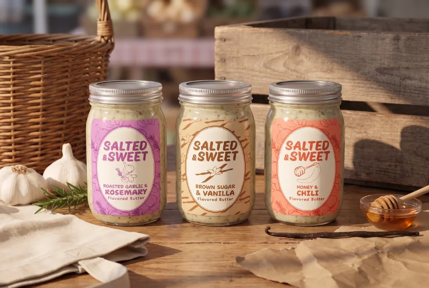
Packaging
Label set
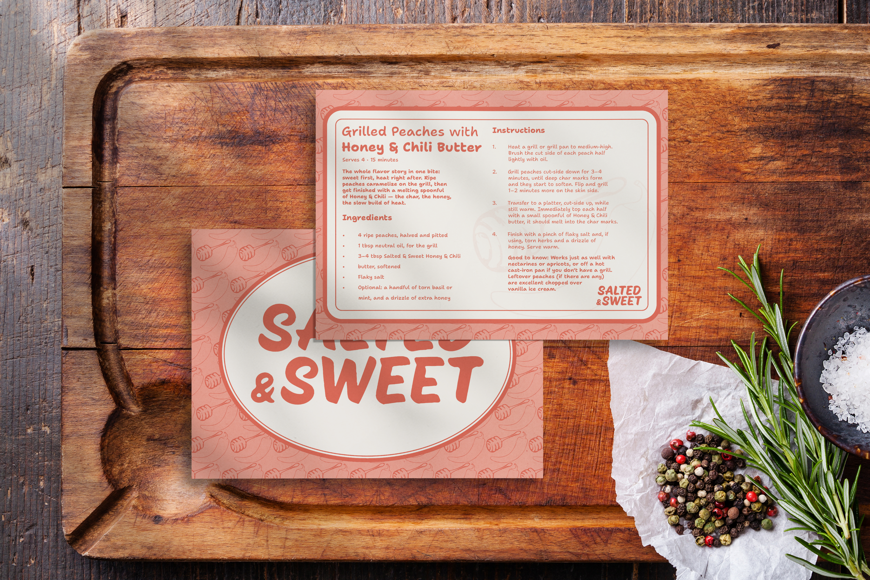
Recipe card
Motion graphic
Social media motion graphic
Client: Salted & Sweet
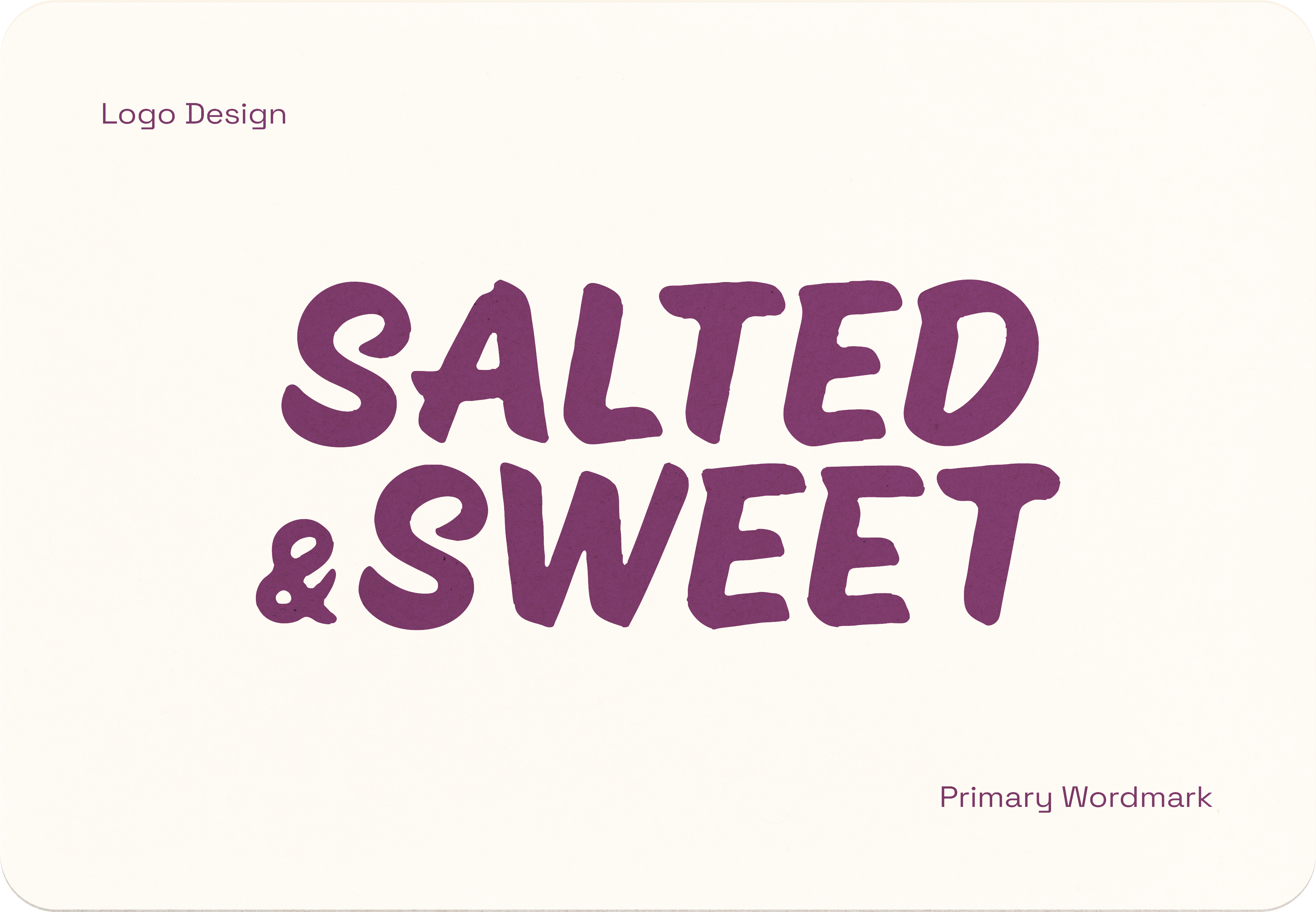
A handcrafted and
playful identity.
I led this project end-to-end as sole designer and strategist: brand positioning, competitive research, flavor lineup and label copy, illustration style and label system for each flavor, and the product photography and mockups shown throughout this case study.
Salted & Sweet feels like a farmers-market Saturday morning: warm, unhurried, and a little messy in the best way. It's confident enough to pair honey with chili and call it obvious, but never showy about the craft behind it.
Making the digital appear analog
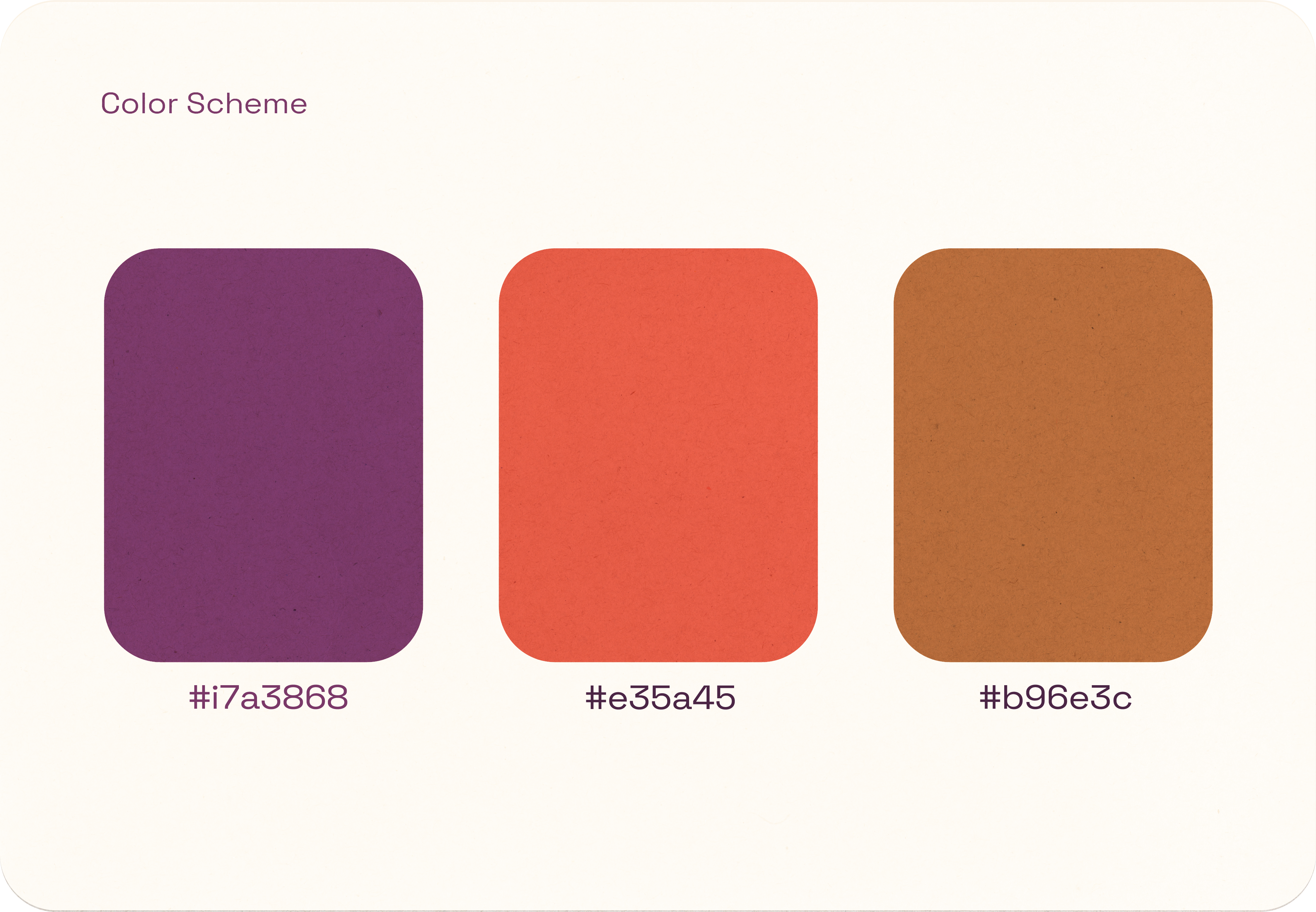
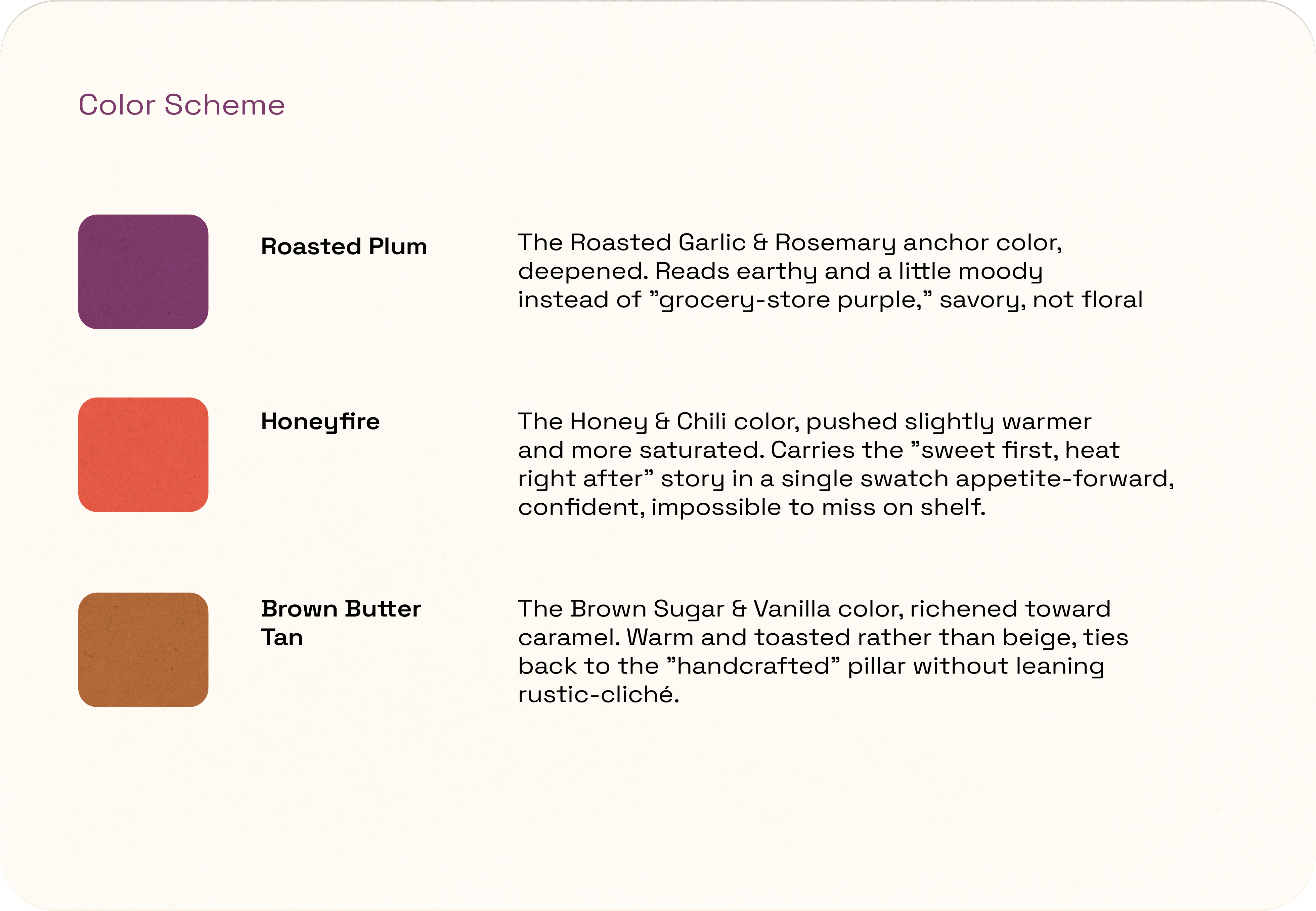
Rather than one fixed palette, each flavor carries its own color, a deliberate choice that lets the product line read as a family without repeating itself on shelf. All three sit in a tightened, more saturated register: earthy and confident rather than pastel or precious, so the palette does double duty as flavor differentiation and brand attitude.
Flavors for all different tastes.
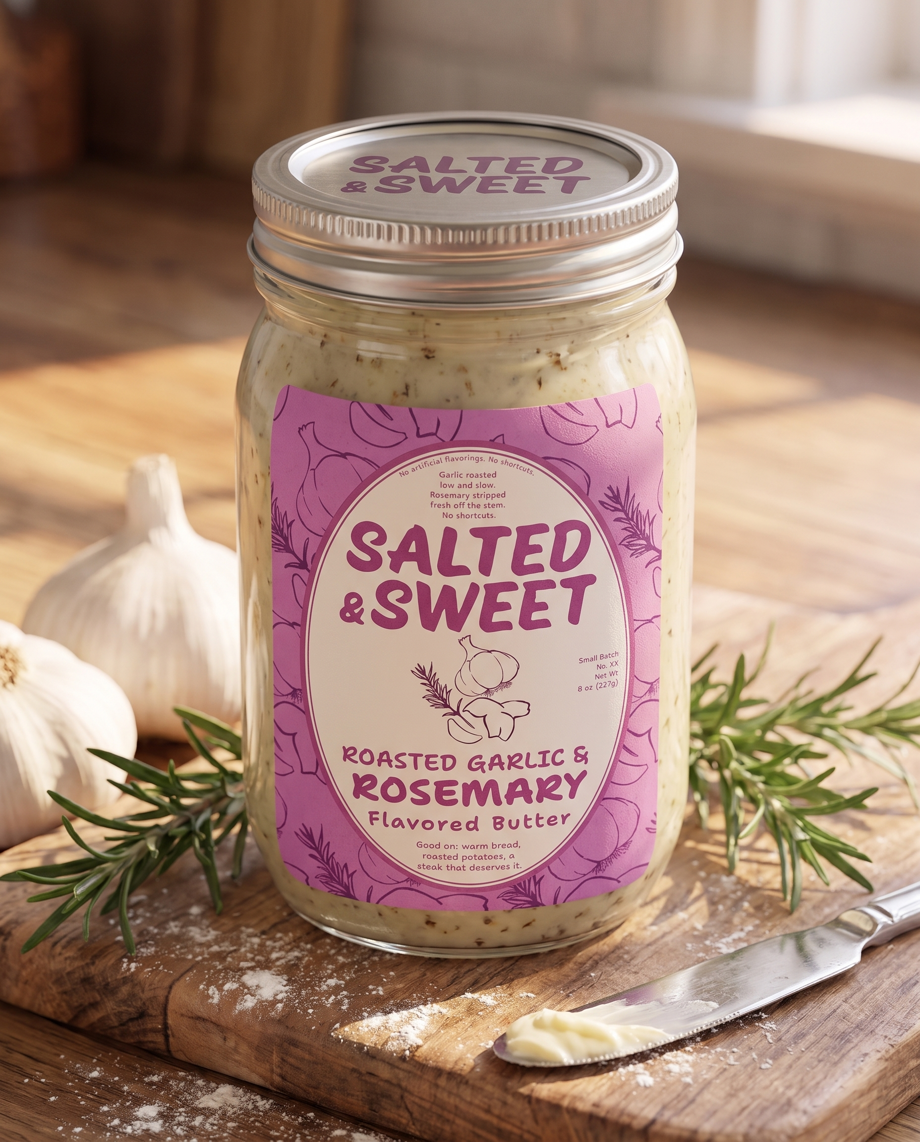
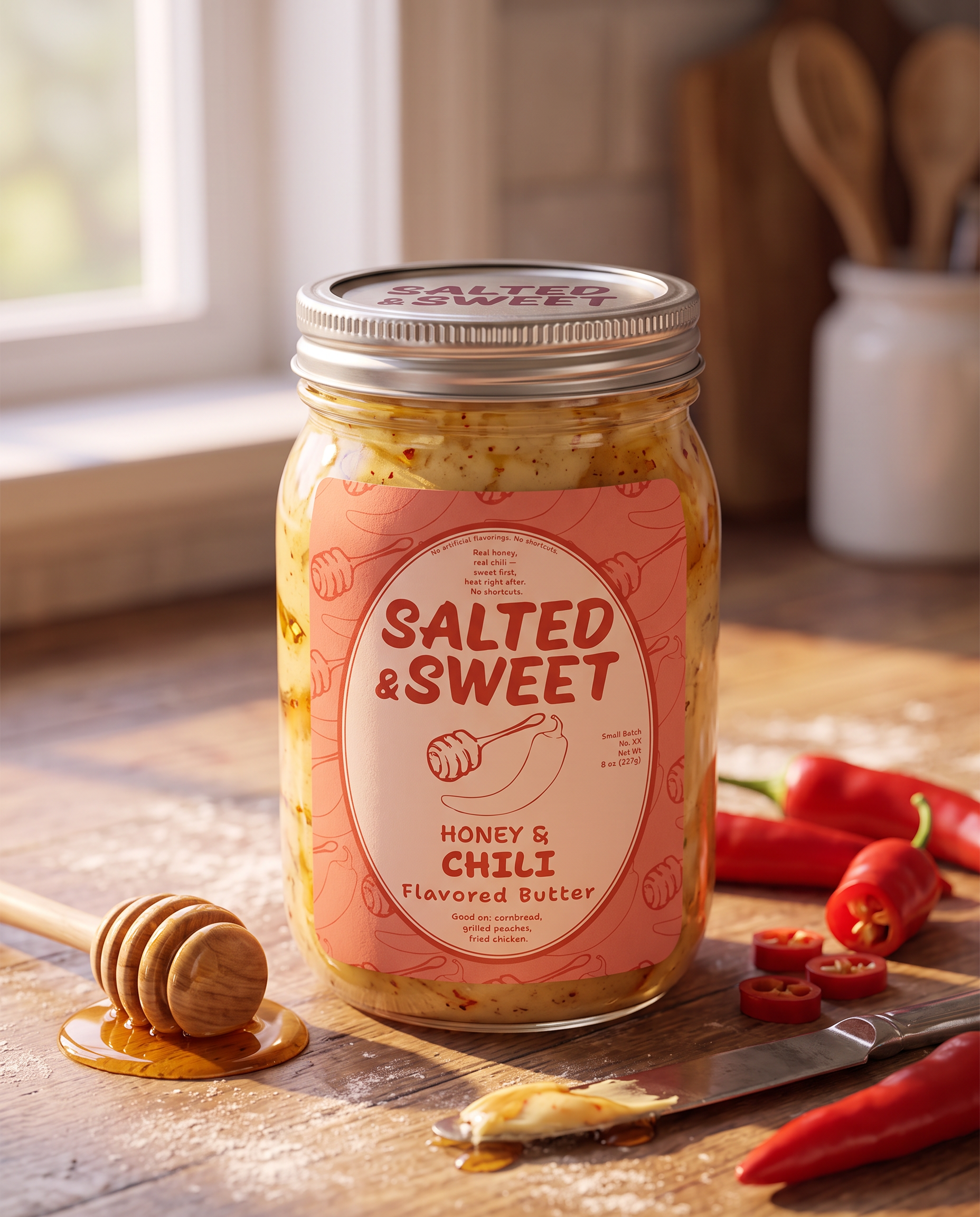
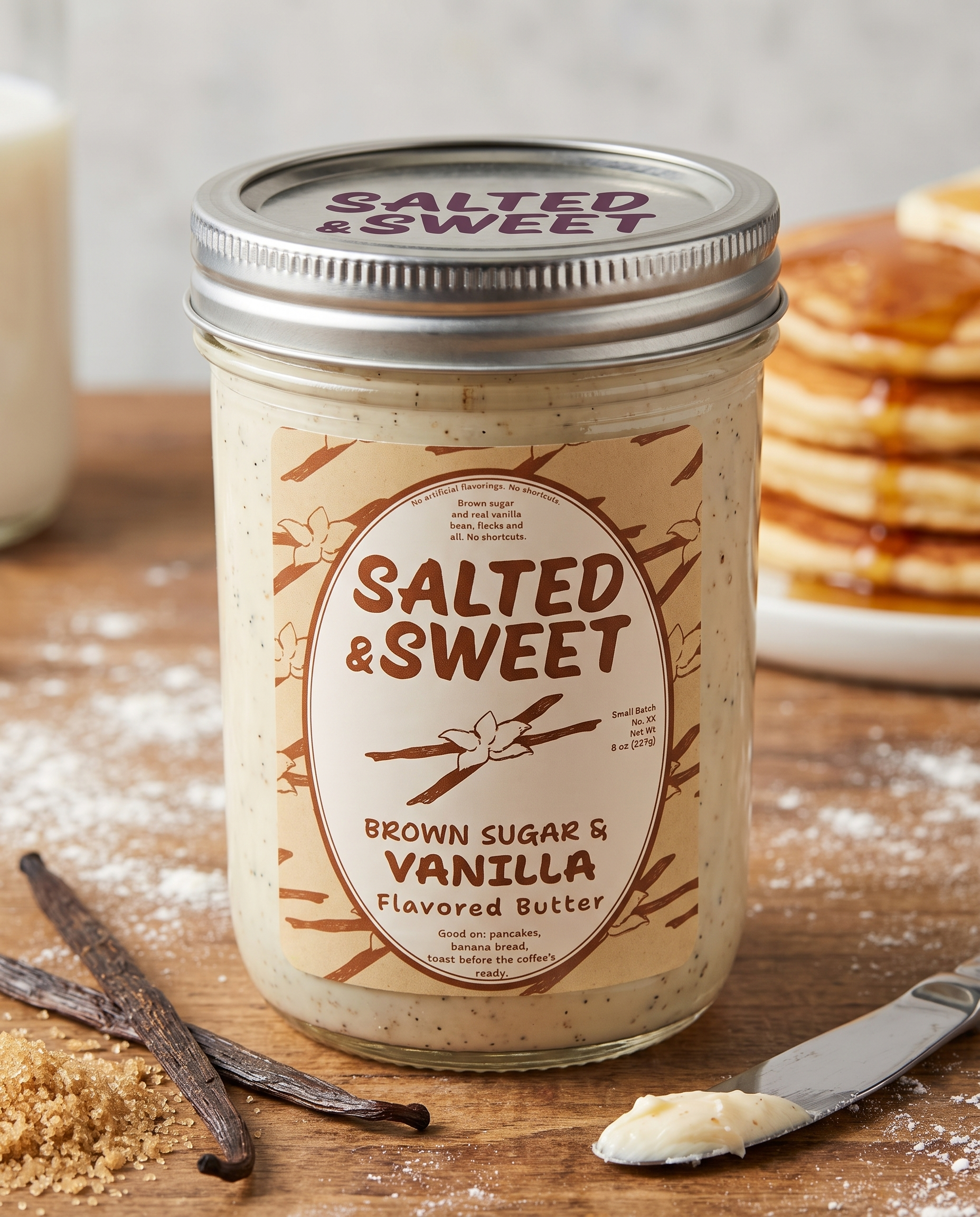
The lineup covers three distinct occasions without repeating itself. Roasted Garlic & Rosemary is the everyday-elevated anchor, familiar enough for weeknight bread, made with real roasted garlic and stripped rosemary, not shortcuts. Honey & Chili is the brand's boldest statement, built entirely around one unexpected pairing: sweet first, heat right after. Brown Sugar & Vanilla rounds out the set as the baking-and-breakfast flavor, with real vanilla bean flecks doing the proving.
Spread the Word
Salt falls, sugar rises, the ampersand catches both. It's a two-second loop and it's the only animation they need. I handed it over as three square templates, one per flavor, they fill in themselves, so nothing has to come back to me to post a new batch.
Where it landed
Salted & Sweet is a small-batch flavoured butter brand built on three pairings: Roasted Garlic & Rosemary, Honey & Chili, Brown Sugar & Vanilla. I led the whole thing solo: strategy, identity, packaging and photography.
It should feel like a farmers-market Saturday: warm, unhurried, confident enough to put honey with chili and act like that's obvious. Each flavour gets its own colour instead of one fixed palette, and the hand-altered wordmark keeps the system looking made rather than manufactured. The two-second loop closes it out: salt falls, sugar rises, the ampersand catches both. It shipped as three reusable templates so they can keep posting without coming back to me.