Extra Life
The Intersection Between Sustainability and The Resell Market - New Age Games
Motion graphics
3D
Packaging
Packaging
Motion + social
Pop-up environment
Self-directed concept
Insert Coin - Overview
Every year, mountains of old consoles, controllers, and games get thrown away instead of played again. Only a quarter of e-waste in the U.S. ever gets properly recycled. New Age Games is a brand and pop-up event I designed to intercept some of that waste before it hits the landfill, by doing something the recycling industry rarely does: making giving up your old games fun.
The challenge
Pre-owned game retailers have an image problem: bargain-bin, slightly embarrassing, a last resort before eBay. Sustainability branding has its own: earthy greens, leaf icons, a tone closer to obligation than invitation. And almost every retro or pre-owned brand reaches for a third shortcut, 8-bit fonts, scanlines, a synthwave grid, some flavour of 80s and 90s nostalgia. That well is dry. It's such a crowded default that it reads as a costume rather than an identity, and it dates the brand to a console generation most of its customers never owned.
So New Age Games skips a generation. Instead of the 80s and 90s everyone is already mining, it leans into the early 2000s: the sixth-console era of glossy plastic, aqua gel buttons, bubble-rounded sans, and translucent teal hardware. Close enough to feel current, far enough to feel like a throwback, and almost nobody in this category is there yet. It's also the last moment when trading a disc across a counter was completely ordinary, exactly the behaviour the brand is trying to bring back.
Strategy & insight
Gamers already have a mental model for this, they just don't call it sustainability. Trading in an old cartridge for a new adventure, resurrecting a broken console, opening a mystery loot box: the culture is already built around giving old things new life and rewarding the unknown.
So the strategy became: don't sell "recycling." Sell the thrill of the trade-in. Every touchpoint treats an old, broken, or unwanted game not as trash being disposed of, but as currency for the next discovery, quietly making the environmental win a side effect of something players already want to do.
That insight is also why the brand looks the way it does: instead of the expected forest-green palette, I built the identity around an electric CRT-teal: the glow of a screen, not a recycling bin. Sustainability reads as alive and current, not dutiful.
Identity system
Every direction here was tested against one filter: does this look like every other pre-owned game brand's default pixel-art, 80s-throwback moodboard? If yes, cut it. What replaces it is early-2000s: gel-tab gloss, rounded bubble letterforms, translucent teal plastic, the confident chunky signage of a 2003 game shop. Arcade structure (signage proportions, cabinet geometry, rating-box conventions) gives it bones, so the throwback reads as a deliberate era reference rather than a costume.
Logo. The mark pairs a five-point star with a bold, rounded wordmark drawn off early-2000s bubble sans rather than pixel-font nostalgia: it needed to read clean at pop-up signage scale, not just cute on a business card. The star does double duty, it's the universal "extra life / power-up" symbol from decades of games, and it becomes the literal rating stamp on packaging later in the system: one mark carrying both an emotional cue and a functional job.
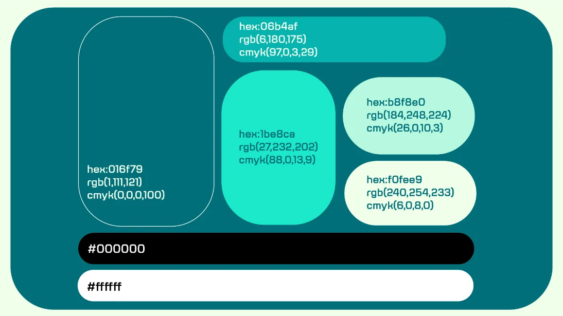
Color. The palette runs from a deep teal anchor (#016f79) up through an electric cyan-mint (#1be8ca, #06b4af) to a pale mint and near-white cream (#b8f8e0, #f0fee9), plus true black and white for contrast and legibility. It behaves like a screen gradient, dark to glow: the same family of teals that translucent 2001 console shells and aqua interface chrome were built from. Just as important is what it isn't: no CRT-green, no magenta and cyan synthwave pairing, no muted retro cartridge tones. Those read as costume, and this palette needed to stand next to a modern tech or lifestyle brand without looking out of place.
Iconography & pattern. Star and "plus/power-up" motifs repeat across signage, packaging, and backgrounds as a modular pattern system, small enough to read as texture, but built from the same shapes as the logo, so nothing feels like decoration bolted on after the fact.
Typography. The wordmark's rounded, slightly inflated character carries into supporting type: confident, a little chunky, sitting squarely in the early-2000s bubble-sans lineage, and built to hold up on a signage wrap or a controller-sized box spine as well as it does on a webpage. Deliberately not a pixel or bitmap face: those jump straight back to the decade this brand is trying to move past.
Packaging
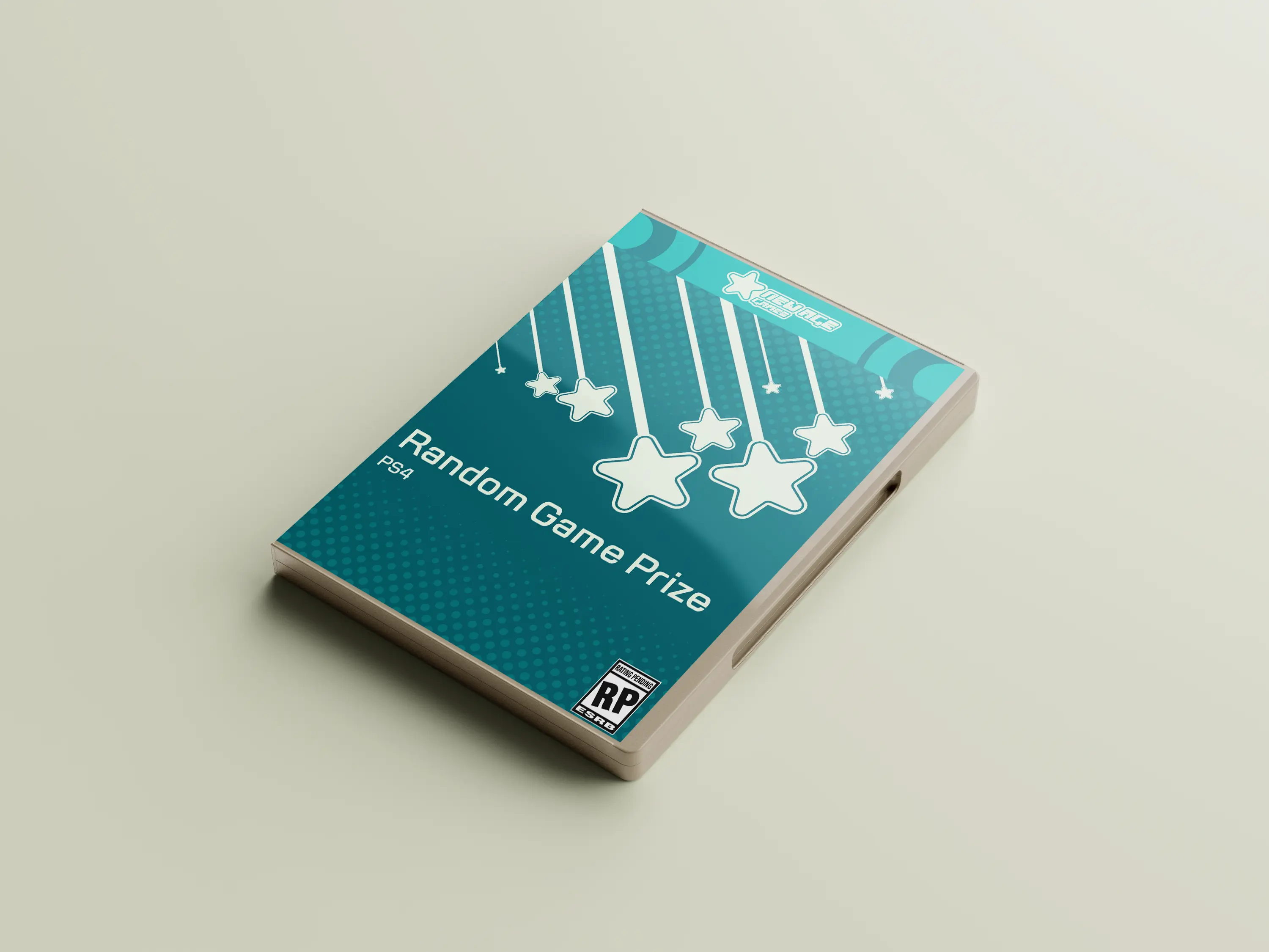
The pre-owned game cases and the "Random Game Prize" box are where the trade-in insight gets literal. Every case keeps the honest bones of a real retail game case (spine, cover art, rating box), but the "Random Game Prize" swaps the ESRB's real rating for a wink: "RP: Rating Pending." You don't know what's inside until you open it. That's the whole point: buying pre-owned, or trading in for a mystery prize, should feel like the best part of the shelf, not the clearance section.
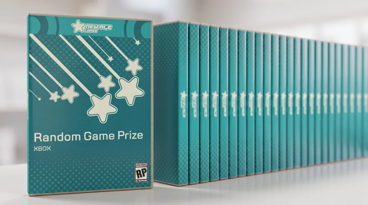
Lined up on a shelf, a full run of prize boxes reads less like inventory and more like a set to collect, exactly the behavior that keeps games out of a drawer (or a landfill) and back in circulation.
An early pass over-scaled the star pattern repeating down each spine. On a single case it looked fine; lined up as a full run, it competed with itself and drowned out the one element that actually needed to read from across a shelf: the "RP" rating badge. The fix was restraint: shrink the pattern, let the rating gag stay the focal point. Shelf-scale thinking that only shows up once the full system is laid out side by side, not judged one case at a time.
Motion & digital
Motion needed to do two jobs: give the static identity some of the same "bonus round" energy the packaging has, and travel well across the platforms where a pop-up event actually gets discovered: Instagram, TikTok, event signage.
The star mark ignites and locks into the wordmark, a loop short enough to work as a social sting or a signage idle animation.
The star/power-up pattern in motion, used as background texture on signage and social content so the brand never feels static even when nothing else is happening on screen.
A pop-up event announcement built from the same motion language, so the first thing someone sees on a feed already looks like the event itself.
The pop-up experience
This is where the strategy becomes physical. The pop-up is a mini arcade built from cabinets spanning multiple eras of gaming, itself a small act of the brand's own philosophy: a repurposed arcade cabinet is exactly the kind of "old hardware, new life" story the brand is selling. The cabinets are wrapped in the brand's pattern system so the space reads as one identity, not a rented arcade with logos stuck on top.
Digital signage throughout the space keeps the tone playful rather than instructional ("having fun? grab your prize"), turning what could be a transactional donation counter into part of the game itself.
The mechanic that ties it together: entry is $5, or one game or accessory you're willing to give up. Give something up, and you pull a mystery loot box from the prize table in return. The donation machine on-site is where that traded hardware actually gets collected for reuse or responsible recycling: the literal e-waste-diversion moment disguised as the most rewarding part of the visit, not the most virtuous-feeling one.
Built for a broad audience deliberately: ages 18 to 49 covers everyone from someone who grew up on the cabinets in the back row to someone who grew up on whatever's running on the front one, so the mix of eras on the floor is common ground for several generations, not nostalgia for one.
Outcome & reflection
New Age Games is a self-directed concept project: no client, no launch data, no press to cite, and I want to be upfront about that. What it does demonstrate is that I can carry one strategic idea (make the sustainable choice the fun choice) through every layer of a brand without it thinning out: identity, packaging, motion, and a fully designed physical space that all argue the same point from a different angle.
If this ever became a real, running event, success wouldn't be a vanity metric. It's simple: more consoles and cartridges walking out of drawers and into someone else's hands instead of a landfill, and a brand people actually want to be seen at while that happens.
If I pushed this further, I'd design the donation machine's interface itself. Right now it's implied as a piece of the environment, but it's the one touchpoint where I'd want someone to actually see, in the moment, what their trade-in prevented. That's the natural next system to design.